


The Case Against Rachel Maddow
11.16.10
I watch the Rachel Maddow show, and I generally find her a genial, engaging commentator, but there are also times where she clearly bends the truth to fit her agenda. EVEN WHEN THE TRUTH ALREADY AGREES WITH HER!
Case in point, compare the percentages in the graph below (from her 11/16 show) to the size of the bars used.
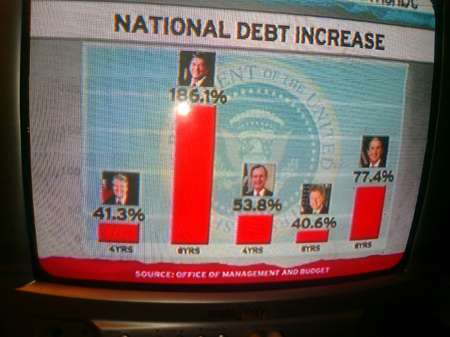
In her segment tonight, Rachel wanted to demonstrate that Republican Presidents increase the debt far more (by percentage) that Democrats do. And the numbers bare her out.
But Rachel (and her staff) weren't content to stick to the pure numbers. Instead, they distorted the graph to make the disparity between Republicans and Democrats even larger.
The first distortion that you may notice is that the band covering "0 to 50%" is noticeably shorter than the higher bands. George W. Bush increased the debt by 77.4% vs. his father's 53.8%, but if you compare the size of their "stacks," you'd think that Bush had more than doubled his father's record!
Now, compare that to the Democrats (both admirably under 50%) and you'll see not only is the 0 to 50% band shorter, but Bill Clinton's stack in no way matches his percentage. Why is his 40.6 less than half the height of George Sr's 53.8%? Why is it a mere 25% of George W's 77.4%? Heck, why is it more than a hair's width off from Jimmy Carter's 41.5%?
Well, obviously it's because Team Maddow wanted to make a graphical point that exaggerated the difference between the Republicans and Democrats. Clinton's numbers have to be made extra tiny to make W's look extra big.
Here's my crude photoshop cut and paste to underscore my point:
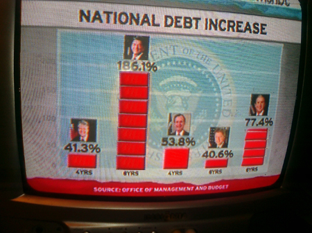
Note that we can fit 7 of Jimmy Carter's stacks into one Reagan stack (41.3% times 7 = 186.1%?) and over 4 of Clinton's stacks into one W stack (40.6% times 4 = 77.4%)? Really?
Well, here's a graph especially for Team Maddow, because I understand that they like data: